1. They changed pretty much everything. Her head was raised to give her a longer looking neck and her hair was moved to make her neck look slimmer. Her eyes were lowerd and made bigger. Her face was darkened in some areas to make her cheekbones more noticable. And her lips were moved to look fuller.
2. I think it is not ethical to change a persons looks like this. Even if the person volunteers for something like that, it can still lower their self asteem and the way they look at themselves. It also sends the wrong message to little girls, "Why cat I look like that?" It sucks to think your not pretty like the models and sometimes they arent even as pretty as they look in pictures.
3. No, it couldnt be more ethically wrong. Its already horrible enough to me. But of course they could take a really overweight woman and make her look like a size 2, but how is that much more wrong then what they've already done ?
4. It could be okay to change photos if there was something really wrong with it or if you wanted to change it for a good reason...
5. I dont think theres a huge differance between photography and photojournalism. Every thing in the picture is a model. They both are displaying something whether it be a person or object.
6. Taking a photo is like catching the moment on film. Theres that saying "A Pictures Worth A Million Words". Pictures tell a story of whats going on in the world. What is and isnt ethical.
Thursday, December 10, 2009
Saturday, December 5, 2009
Monday, November 30, 2009
My First Print.
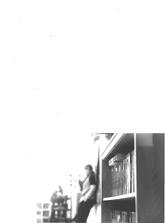
1.) The book shelf on the far right of the picture us the most focused. It looks like the farther back that you look the less focused it is.
2.) The color contrast between black and white is pretty good. The whiter it is shows the lighter the spot is and vice versa with the black.
3.) I think I followed the rules pretty good. Its a simple picture, it was taken from a low view point, theres a pattern in the books. I really like it..
4) Theres no yellowing or spots on my print. Its all black and white.
5) Theres no print rings either.
6) Yes, All of my prints, negatives, contact sheet and all that good stuff is in my folder.
Captions:
Ms. Crump's class does SSR (Silent Sustained Readin) Once a week. Last week during 4th period, the class really enjoyed their SSR time.
Monday, November 23, 2009
Photo Manipulation and Ethics.
A. The main point of the story is to show how the pictures were edited. They show both the original pictures and the edited ones. You can really see the difference...
B. I think it could go either way. Sometimes it could be acceptable to edit pictures for the good. Like if its a really messed up picture, you can change it to make it better. But, it could also be unethical too. When the picture is edited in order to belittle someone, or give some kind of sick personal gain then it would be wrong.
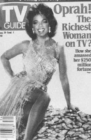 This Photo is DEFFINATELY the most unethical. This is Oprah's Big Ol head on Ann Margret's body. This is first of all sending the wrong message to woman, that "If Oprah can lose 100 pounds, so can you!" message. It also shows that Oprah or whoever did this is a bold face liar. Ugh, its just so hideous!
Thursday, November 19, 2009
Negative Evaluation.
1. I think all of my negatives came out pretty good. You can see who and what is on the picture clearly. Theres no major screw ups, so I think they look good.
2. All of my pictures should come out okay. The only thing that might look bad is if i angled the camera wrong or moved when I took it. But I dont think they'll be crappy...
3. The picture I think will turn out the best is one of a book self. The self was really focused and in the background you could see the teacher standing by the board, but she wasnt as sharp as the self. I thought the shot was really cool when I took it and I cant wait to see it printed.
4. I think the focus of the same picture from #3 will have the best focus. Just because the focus is a bit divided.
5. The compostition that is the clearest in my picture is probably simplicity. Its just a book self and a teacher. Oh and view point.
Tuesday, November 17, 2009
Extra Credit-Photo Of The Day.
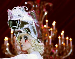 I think this picture is a pretty good example of Background. This weird chick is the main focus of the picture and the chandilier is kind of out of focus. It looks flat to me, with makes it a background!
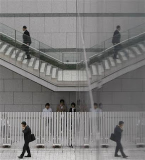 This is a example of Symmetry. The mirror reflects back the scene which makes it double up. There are also alot of Patterns in this picture. Like the stairs and the lines on the gate.
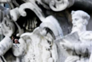 I think this is Framing. The focus is one this statue thingy, but when you look closer, you can see the little guy in the hole. Its making a little frame around him.
Friday, November 13, 2009
American Soldier.
A. One of the most powerful pictures I saw was in the set called "Signing Up". There were two best friends. They were sitting on a car crying because one of their friends left to be a soldier. The caption said: After Ian rides away, Shane and "Buddha" weep as they rest on Shane's car. "As soon as we saw him driving off, that's when we realized how real it was," "Buddha" says.
B. The sequence called "Coming Home" was the most powerful to me. It showed how happy his family was to see him come back. It was very lovey dovey with all the smiles and kisses. It was touching.
C. The story thats told is pretty much the whole process they have to go through, from beginning to end. How they have to get themselves emotionally prepared to leave their family. How their life is when they leave and the changes they have to make.
--------------------------------------------------------
Captions:
A. Hand-in-Hand, Devin & Ian state their vows and say there "I Do's". Minutes later, they left the courtroom as husband and wife.
B. While in basic training, the soliders used balloons for target practice. "By the time I finsished blowing them up, I was too tired to do anything with them!", jokes Ian.
C. After being accepted into the army, Ians family and friends decided to throw him a party. His mom found the perfect cake for the celebration.
---------------------------------------------------------
A. The videos enhance the photos alot. They help tell the story from each persons point of view. They each get to express what they were feeling and what they were thinking during the time the photos were taken.
B. The videos are better because even though the pictures can show alot, the videos give more feeling to whats going on. The pictures are frozen in time and the videos explain more then a caption.
C. The photographs are better then the videos because you can catch each emotion and really study whats going on around the people in it.
Wednesday, November 11, 2009
Malboro Marine.

A. Luis Sinco had to do alot more then just take pictures. To put them in the order he did, he had to know the story behind the pictures. He used the pictures to match what the speaker was saying. If they talked about Iraq there were pictures of the war there and if they talked about their pesonal relationship with others, thats exactly what was shown.
B. This slideshow had alot of meaning to me. You never know how much these people are hurting. I didnt really realize that they thought about what they were doing. They arent robots wired to kill people, they are people themselves and most of them do think about what they did and it haunts them to a serious point.
---------------------------------------------
A. I liked the picture of him with the cigarette in his mouth. It pretty much symbolizes everything his story is about.
B. The most powerful sequence of pictures were the ones talking about his depression. It showed how this guy was really hurting over the fact that he had killed so many people.
C. The audio helped tell what exactly was going on. You could hear some parts where the speaker would get really emotional and it would add a more personal meaning to the picture the slide was showing.
D. The pictures are in kind of a chronological order so it helps tell the story from beginning to end.
Shoot Reflection.
1. One Problem I faced was trying to get close. Every time I got closer they would either pose or hide. Whenever they started screwin around, I would just find someone else to get a picture of. Sometimes I couldn't get the picture from the angle I wanted and that was really frustrating. I just had to adjust myself to get what I wanted.
2. Some of the technical stuff I was thinking about was how was the ligting in a certain part of the room. How I held the camera in order to get the best shot. How sharp the focus was & how could i make it better. Its more then just snapping pictures & I guess I didnt realize that.
3. One composition technique I tried to get was view point. I wanted all my pictures to be coming from how I see things. I'm short so everything I see looks big. When I take pictures from a low place, like on the floor, it shows how everything might look to me (:
4. I want to try getting closer to people and having more variety of what my pictures look like.
Wednesday, November 4, 2009
Developing Black & Whites.
1.) Take the film out of the cassette In total darkness. Remove the film from the cassette by pulling the flat end off with a can opener and unwinding the film from the spool by peeling off the tape holding it.
2.) Then you have to load the film into plastic film reel, for beginners. Than you slide one end of the film into a slot on the outer edge of the reel and "walk" the film in until it is gone. Metal reels are harder because they need a higher degree of dexterity.Following the instructions that come with the tank, you might want to practice loading a reel in the day light with film you dont plan to use. So you can get a feel for it.
You might mess up so try not to use important film the first time you try.
3.) Put the reel in the film tank and cover it securely. You can now turn on the light.
"Soup" Time
When you are ready to process your film lay out the chemicals in front of you: a film developer, stop bath, and a fixer with hardener, and a *hypo eliminator bath.
4.) Make sure to carefully control the tempereature of the chemicals. The developing time depends on: the speed of the film and the temperature of the chemicals. The best temperature to keep these chemicals is 68-70 degrees. You can develop at slightly higher and lower temperatures as long as you make adjustments depending on the brand, but each company gives recommended processing times and temps on the packaging.
High temperatures could cause "*reticulation", which gives film a coarse, overly-grainy appearance. This can be an interesting effect to play with, but if not if you're trying to get the best negative possible.
5.) Now you pour developer into the pour spout, and cover it. Do not open the tank! To keep fresh chemical on the film surface, turn the tank upside down once a minute briefly. When it is upright again, tap it several times against your work surface to remove any air bubbles that might form, the bubbles will make dark under-developed spots on negatives.
Develop film for the time recommended on the packaging. When done, take the lid off the tank's pour spout and pour it out.
6.) Pour water into the pour spout for one minute to stop development. Or mix a small amount of *Glacial Acetic Acid with water and let the film sit in that for 30 seconds to wash off the developer. This is a stop bath.
7.) To now fix the image so you can view it in normal light use the fixer with hardener. This will help you help protect the negative from getting easily scratched. Fixing the film should take 5-10 minutes, depending on if you used a normal or rapid fixer.
8.) Now you can remove the tank cover completely, and let the film sit in cold running water for five minutes.
9.) Then to remove all traces of the fixer pour in a tankful of *Hypo Eliminator and agitate for two minutes.
10.) Run the film under cold water again.
11.) Take the film out of the tank. And never touch the surface of the negatives. Use washing pins or film clips to hang the film to dry.
12.) In 1-2 hours, the film will be dry. Use scissors to cut the film into strips, six negatives long. Be careful to not cut the pictures. Store the negatives in clear glassing envelopes or PVC plastic negative pages.
Definitions
*Reticulation- the formation of a network of cracks or wrinkles in a photographic emulsion.
*Acetic Acid- CH3COOH, also known as ethanoic acid, is an organic acid which gives vinegar its sour taste and pungent smell.
*Hypo Eliminator- Bath used after fixer bath and intermediate wash to remove fix from film or print.
Funny Captions.
Monday, November 2, 2009
Repetition.
Twirly Barbie - A table football game using Barbie dolls is displayed at the International Design Festival in Berlin.
Slice of HeavenJudges rate Alpine cheese in Oberstdorf, Germany. Jury members at the 5th Alpine Cheese Olympics rated over 700 kinds of Alpine cheese from all over the world.
Friday, October 23, 2009
Show And Tell.
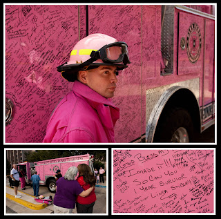 I really love this picture because its for breast cancer awareness. I think its beautiful when people get together and do stuff like this to show that they care. I get very emotional when it comes to cancer. I have alot of family suffering from it and I know they appreciate it when people show them love like this.
I like broadway. I really want to go to New York one day. In this video, the Broadway Across America Austin and the Bass Concert Hall are showing all the inside things, like backstage, makeup stuff like that. I thought it was pretty cool.
Wednesday, October 21, 2009
Friday, October 16, 2009
Yearbook Pictures.
I think this picture is filled nicely. The main focus is on the chick but you can still see the scenery. It shows the way high school might look to us-very busy. Kids are moving from class to lockers to their next class. I think this picture is sending the message that not many of us sit back and relax for a second because of the rush we feel at school.
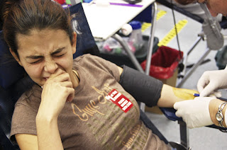 Action or Emotion;
This picture reminds me of myself. That is the exact same look I have on my face when I have to get a shot. This girl is deffinately in pain. You can feel the hurt just screaming off her face. I love it! Well I dont love the fact that she's in so much pain, I love the fact that this is real. This is probably what most people feel like when they have to go through something like this.
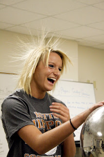 Telling a Story;
This picture makes me laugh. I think the story its telling is that this girl is having a really good time in class and she might actually be learning something. Her expression is so shocked, like she really wasnt expecting her hair to do that thing its doing. I can just imagine the classes reaction. Its one of those very rare memorable moments you have at school that you remember one day and you tell your friends "hey you remember that one time in that one class when you did that one thing?? yeah. good times" haha
Wednesday, October 14, 2009
Contest Winner!
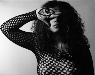 This picture is very powerful to me. The creativity of it deffinately is what caught my attention. The lighting reminds me of a eclipse the way its dark on one side and light on the other. Its a pretty simple picture because it has a flat background, but the way the space is used by this girl is really cool. I dont think I would have liked this photo if it wasnt done in black and white. It has a very metalic look. I like it. (:
Monday, October 12, 2009
Great Black And White Photographers - Part 3
1.) I guess the first thing i noticed about these pictures are that they have a very rustic, ancient look. I like the fact that they're not taken in color because if they were in color they wouldnt have the same affect on how I look at them.
2.)
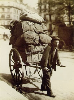
I see an old man with a load that looks way too big for him.
I smell this old guys sweat and potatoes...I think thats whats in the sacks. Potatoes.
I hear cars passing by and children playing.
I taste potatoes!!!
I feel the exhuastion rolling off this man. He has got to be tired!
I smell perfume and expensive foods made by the servant girl to serve to some stuck up princess.
I hear the princess rushing the servants and their annoyed sighs.
I taste the food and how good it is. Its rich people food so of course its good.
I feel the need to hurry. The rush of the servants trying to get things done for this stupid princess.
3.) I would like to do a poster for the great photographer thing. Its the best and easiest way for me to get creative.
Tuesday, October 6, 2009
Hurricane Ike
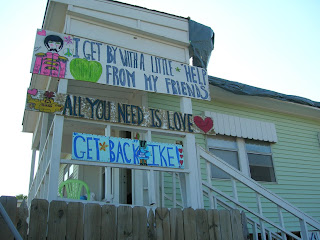 I like this picture because the photographer didnt really focus on the hurricane itself, but he focused on the message the people had. This picture is also a good representation of the rule of thirds if it was split horozontally.
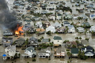
This picture really caught my eye because it was taken from a distance and it catches pretty much a whole neighborhood. You can see the rows of houses and it kind of reminds me of a pattern. The fire also catches my attention. I think that might have been the photographer's intention, to catch the fire because its basically a flame on water.
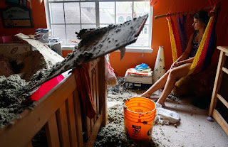 This is a really good discussion picture. Its focus is the girl in the room but the message is bigger. The way her face looks is probably a feeling all of the people had. Its also a very simplistic picture. Its not alot of commotion or more then one thing thing to focus on.
Friday, October 2, 2009
Great Black And White Photographers-Part 2
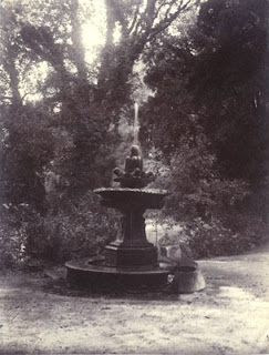

Eugene Atget was born in Bordeaux in 1856. He was an orphan raised my his uncle. At an early age he shipped to sea as cabin boy. As a young man, he tried to be an actor. He started in France where he was usually given unattractive roles, such as a villian. As he got older, acting started to bore him. He then turned to business in the art world. Finally he decided to be a photographer. Atget assigned himself an alluring and provoking subject, the city of Paris, the dream city of thousands of struggling, aspiring, gifted and would-be poets, painters, composers. Paris, the city of art and bridges over the Seine, of boulevards and cafes, of narrow, crooked streets and gray plane trees in the beautiful Luxembourg gardens. Atget was so devoted to his photography. He would rise early in the morning for shots and even changed his diet- I'm not sure what that has to do with photography, but he did it. Atget died in 1922, but because of a close friend, Berenice Abbott, his work was promoted in America, elevating it to recognition as art, beyond its original reputation as documentation.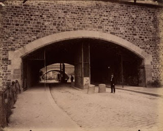

Tuesday, September 22, 2009
Thursday, September 10, 2009
9/11
Simplicity. 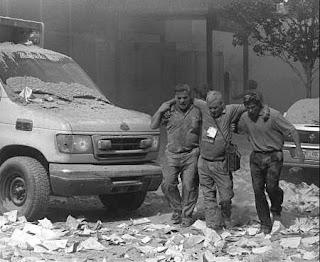 This photo is very simple, but still tells exactly what happened. It includes the three men helping each other, but also the surroundings add to the simplicity. There arent people running and screaming, but it shows what everything must have looked like around them.
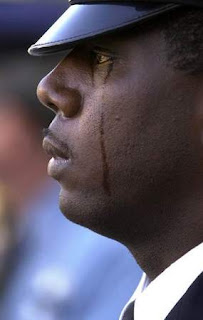 This picture discusses the pain felt because of 9/11. It symbolizes how every one must have felt about the whole situation. And because this is obviously a grown man crying, it sends the message that its okay to cry.
 This photo is very simple, but still tells exactly what happened. It includes the three men helping each other, but also the surroundings add to the simplicity. There arent people running and screaming, but it shows what everything must have looked like around them.
 The Rule Of Thirds.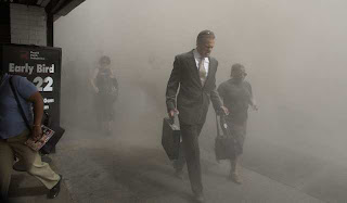

Im not sure why I picked this picture for thirds. If you split it three ways, you probably wont get much of a picture. I guess this was my mistake!
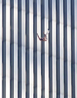
Lines.

I like how this picture shows lines. The man in the picture isnt falling horizontally, he's falling vertically. I think the lines in this picture lead to him nicely.
Balance. 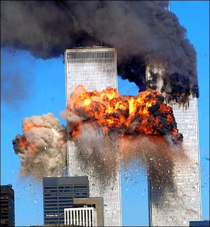

This photo shows the equal balance between the two towers. Even though they are both exploding, they are still congruent to each other.
Framing.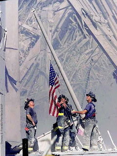

I think this is almost a perfect picture. The flag is slanted, showing the act of raising it. If you put a frame around it, i can garuntee it will be hanging in some patriots home.
Discussion.
 This picture discusses the pain felt because of 9/11. It symbolizes how every one must have felt about the whole situation. And because this is obviously a grown man crying, it sends the message that its okay to cry.
Tuesday, September 8, 2009
Words.
These 4 words are important to me:
Motivation: the drive that moves you to take action; fuel to your fire;
Devotion: to be attatched to; extremely dedicated;
Humor: amusing; to have a sense of; to be optimistic;
Insane: mentally deranged; to act outrageously; no sound of mind;
Aperture: an opening, like a hole or a gap;
Shutter: a movable cover or slide that shuts;
Exposure: revealing something that has been kept a secret; to be exposed, shown;
Depth of Field: range of distances along the axis of the camera;
F-stop: setting an adjustable lens aperture indicated by an f number;
Focal Length: distance from the focal point to the lens;
Thursday, September 3, 2009
-[Pinhole Pictures).

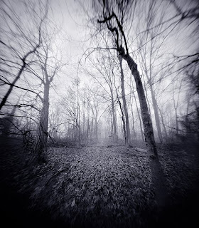 I really like this picture. Its very unique. The way the trees bend make it look creepy, but still cool. The black and white makes it more dramatic and mysterious. It almost looks like its in motion. I also like how the outter part of the picture is slightyl blurred and the middle focus is sharper.
*********************************************************
Subscribe to:
Comments (Atom)


