Simplicity. 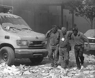 This photo is very simple, but still tells exactly what happened. It includes the three men helping each other, but also the surroundings add to the simplicity. There arent people running and screaming, but it shows what everything must have looked like around them.
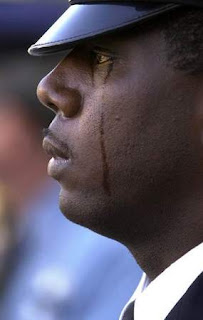 This picture discusses the pain felt because of 9/11. It symbolizes how every one must have felt about the whole situation. And because this is obviously a grown man crying, it sends the message that its okay to cry.
 This photo is very simple, but still tells exactly what happened. It includes the three men helping each other, but also the surroundings add to the simplicity. There arent people running and screaming, but it shows what everything must have looked like around them.
 The Rule Of Thirds.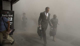

Im not sure why I picked this picture for thirds. If you split it three ways, you probably wont get much of a picture. I guess this was my mistake!
Lines.

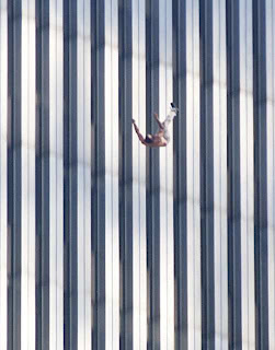
I like how this picture shows lines. The man in the picture isnt falling horizontally, he's falling vertically. I think the lines in this picture lead to him nicely.
Balance. 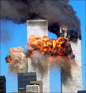

This photo shows the equal balance between the two towers. Even though they are both exploding, they are still congruent to each other.
Framing.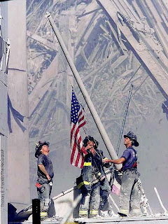

I think this is almost a perfect picture. The flag is slanted, showing the act of raising it. If you put a frame around it, i can garuntee it will be hanging in some patriots home.
Discussion.
 This picture discusses the pain felt because of 9/11. It symbolizes how every one must have felt about the whole situation. And because this is obviously a grown man crying, it sends the message that its okay to cry.
No comments:
Post a Comment